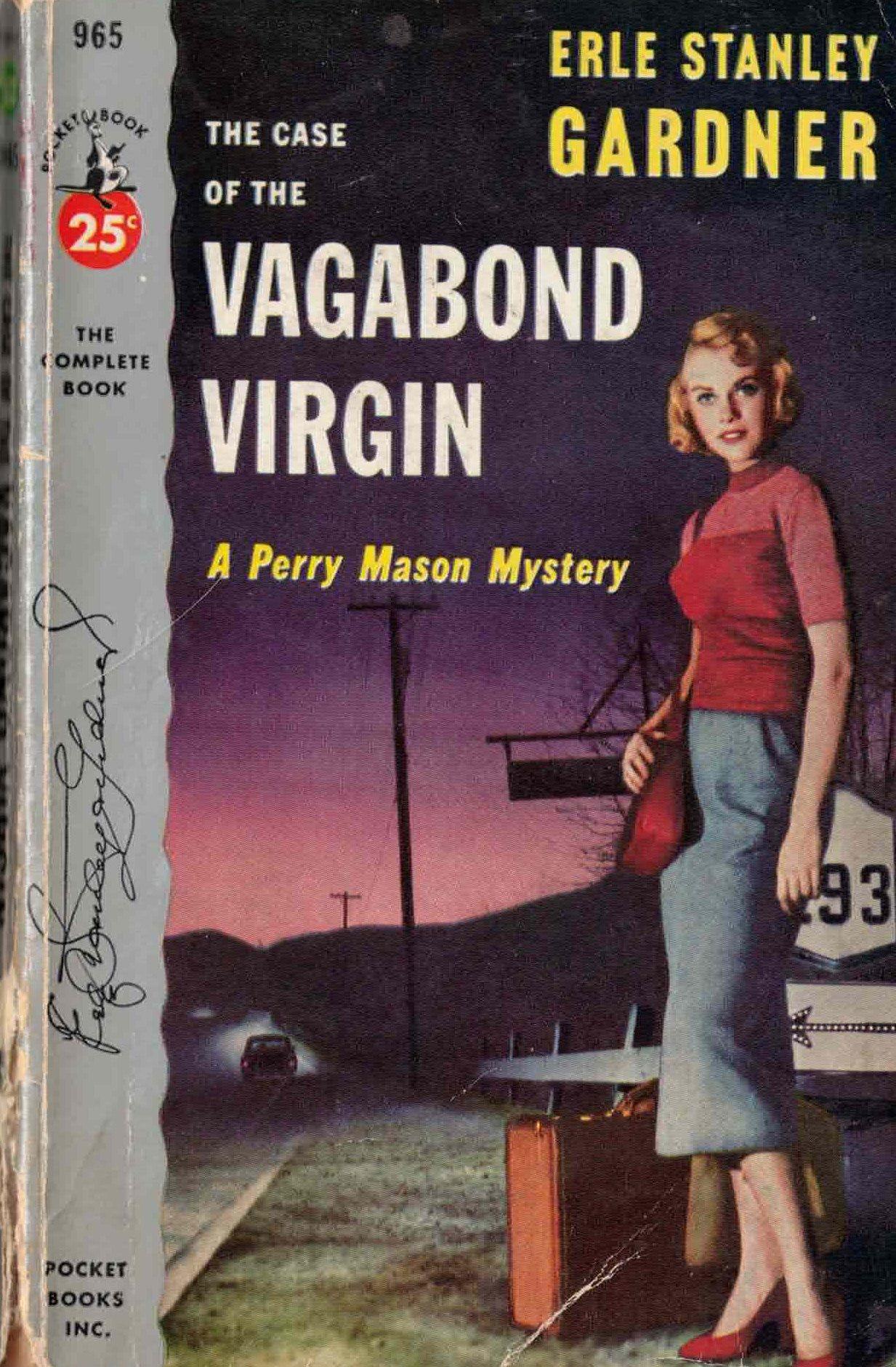
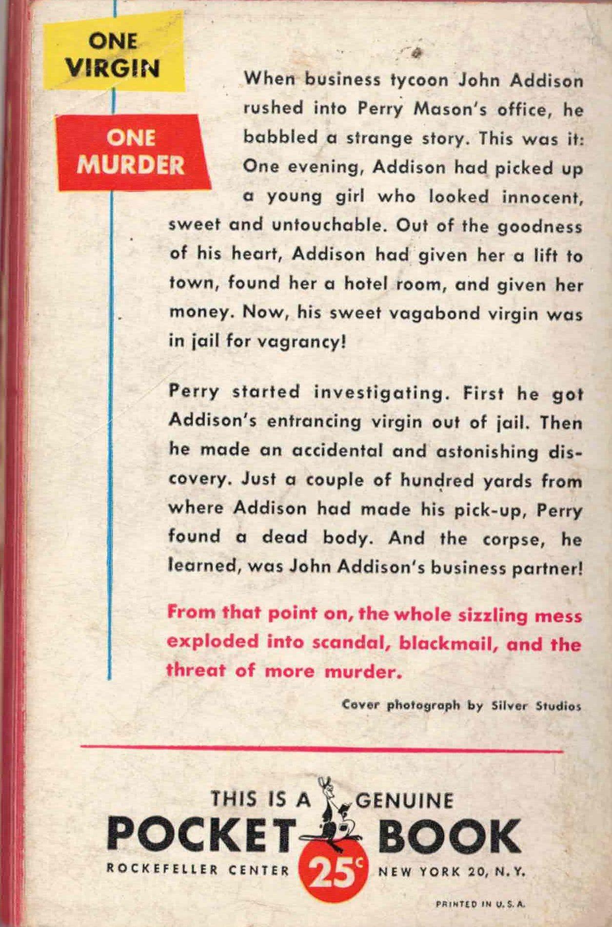
Pocket Books #965 (1953) Cover photograph by Silver Studios
Pocket Books is the first big paperback publishing company. I covered their early history in the very first Paperback Show podcast. I want to discuss how they created their cover design in this post. The standard for the first 10-15 years of cover illustration was the “painting from a photo” style. The cover artist would do a few sketches and then submit them to the art editor at the publishing house. They would choose the cover ideas they liked and then set up a photo shoot to recreate the sketch as a more detailed photograph. The artist and the editor would go over the photos and choose one they liked and the artist would start painting (keeping in mind the title, author, and publisher info. The 900 series (early 1950s) started the design trend of adding a silver bar along the spine edge of the paperback. In the Vagabond Virgin paperback, they’ve added the signature of Erle Stanley Gardner as a sign that the Pocket paperback Perry Mason series of paperbacks meets his approval.
Curiously, the artist is not credited in this book, but the photography studio (Silver Studio) is. Whoever designed this great did an excellent job invoking a noir mood with depth and character. The headlights of the car and the sunset behind the hills add a lonely and desolate feel to the scene. Imagine this paperback on a rack at a newsstand in NYC: you would notice it.
For the entire early print run of Pocket Book covers check BookscansFor more info about cover design and paperback history, Paperbacks, U.S.A. A Graphic History 1939-1959 by Piet Schuders is outstanding